

The Fifth Post on the Five Pillars of Effective Website Design will Focus on Usability by Readers
Formatting:
Break your textual information into bite-sized chunks. Keeping your content in short paragraphs works best for the web – up to four sentences. Longer blocks of text are more likely to be glossed over.
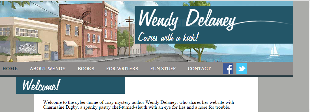
It is better that your text doesn’t run all the way across the page. Eye tracking studies conclude that it’s easy to lose which line you were reading when jumping to the next line, if the width is more than 500 pixels (a normal sized smartphone is 480 pixels wide horizontally). Ideally, a column width for reading only contains between 45 and 65 characters. Adding small graphics with your content will make the page even more palatable – and if presented to the side, will shorten that column width.
Just make sure your images are sourced correctly; it’s a violation of copyright to just grab an image off another site and reuse it without permission. Shutterstock and Dreamstime are inexpensive resources for royalty free images. AllTheFreeStock.com has free images you can use commercially.
Text size:
Text should be at least 12 pixels. Smaller text will be difficult for your older audience to read, plus Google will consider your site not mobile friendly if the mobile version’s text is not 12 pixels or better.
Infographics:
Consider creating a pie graph or other kind of chart to communicate complex data. Especially if you have a large table with a lot of text, translating that data into colors and bars with appropriate labels gets the message across quickly. Here is an article on creating effective information graphics.
Colors and Contrast:
Using white text against a colored or black background can emphasize headings, but should be avoided for the rest of the site. Dark grey text on a white background is pleasing to the eye, but the reverse can be more difficult to read. Also consider that some readers have colorblindness. You can see how your site looks to a colorblind person at vischeck.com.
Of course there are always exceptions; you should research your audience and see what other successful authors in similar genres are doing.
Navigability:
Just like you have a proofreader read your work, you need to have someone else look at your website. You’re probably too close to it to see any mistakes or issues. Can your audience find what they’re looking for? How about a screen reader that blind people use? Click here for more details on usability.
Your links should look different from the rest of your text. The color can be different and/or they can be underlined, or underlined when the user hovers their mouse over the link. The main navigation should be obvious and toward the top of your site. Drop-down menus can allow more links in that area.
Mobile Friendly:
More and more users are browsing websites on their mobile devices, and if your site isn’t mobile friendly, you could be losing half your audience. Plus, Google will not rank your site as highly. How do you get a site to look good on a full sized cinema screen AND a tiny cell phone? The answer is responsive design. The backend code will allow your content to either change or flow with various screen sizes. If using WordPress, it helps to choose a theme that is responsive to begin with. If your site is not responsive and you don’t want to redo it, it’s possible to add some code and make it responsive, although it’s best to hire a professional than try it yourself. There are also companies that will create a mobile version of your site for a monthly fee.[fusion_builder_container hundred_percent=”yes” overflow=”visible” margin_top=”40px” margin_bottom=”10px” background_color=”rgba(255,255,255,0)”][fusion_builder_row][fusion_builder_column type=”1_1″ background_position=”left top” background_color=”” border_size=”” border_color=”” border_style=”solid” spacing=”yes” background_image=”” background_repeat=”no-repeat” padding=”” margin_top=”0px” margin_bottom=”0px” class=”” id=”” animation_type=”” animation_speed=”0.3″ animation_direction=”left” hide_on_mobile=”no” center_content=”no” min_height=”none”][fusion_separator style_type=”single|dotted” sep_color=”#e0f5ff” icon=”fa-bookmark” width=”” class=”” id=””/].
We hope that this series has shed some light on areas where your website can be improved to help you interact with Readers and Media Professionals. The best part is most of these improvements are free if you know how to do it yourself. If not, Chanticleer Reviews offers website assistance and creation as part of their book marketing services targeted specifically for authors.
Rochelle Parry, Chanticleer Reviews’ Creative Director You are welcome to email me at: RParry@ChantiReviews.com
 [/fusion_builder_column][/fusion_builder_row][/fusion_builder_container]

 The Dante Rossetti Awards recognizes emerging new talent and outstanding works in the genre of Young Adult, New Adult, and Tween Novels. The Rossetti Awards is a division of Chanticleer International Blue Ribbon Awards Writing Competitions.


 CrimeLandia Left Coast Crime Scene 2015 in Portland, Oregon
 Now that is a lot to Crow about!

 [/fusion_text][/fusion_builder_column][/fusion_builder_row][/fusion_builder_container]


 Part 2. Establishing Competence and Credibility as an Author in Today’s Digital World of Publishing: Engaging Readers and Building a Fan-base using Leadership Communication Skills
 Authors must recognize the need for strong credentials to demonstrate competence to potential readers, book buyers, librarians, and media professionals.
 Reviews add weight to your credibility. Reviews allow for comparison and judgment thereby engaging potential readers in the mental process of decision making and discussion points. Your promotional efforts are not dissipating into the ether, but are actually getting noticed by potential readers and publishing professionals.
 Kiffer Brown discovers today’s best books with reviews and writing contests at Chanticleer Book Reviews, L.L.C., which she founded in 2010. She is also