Don’t Judge a Book by Its Cover—Or Do!
Make your book *POP* and succeed in the CCDAs!
We’ve all heard the saying, but those of us in the industry know the truth: your cover only has three seconds to catch the eye of a reader. That’s right – three seconds. The cover sells the first book, but it’s the content that keeps readers coming back for more.
The Power of a Great Book Cover Design
Imagine you’re in a bookstore. You’re looking for a thriller that’ll keep you turning pages late into the night. Do you pick the book with a woman walking down a shadowy alley, or the one with a serene beach scene under a vibrant sky?
If you love suspense and intrigue, you know which one you’re looking for. If you prefer travelogues or romances, the other choice is obvious. A great book cover doesn’t just look nice – it taps into the emotions and expectations of the reader. It’s a visual cue that signals what lies within.
In today’s competitive market, first impressions matter more than ever, especially with the rapid rise of digital books. A book’s cover is the first thing potential readers see, and it’s often what makes them decide whether or not to pick up your book, click on it, or share it with others.

Best Practices for Designing an Effective Book Cover
Your cover is a visual ambassador, capturing the essence of your story and compelling potential readers to pick it up, click on it, or share it with others. A well-designed cover signals professionalism, sets expectations for your genre, and serves as a powerful marketing tool to stand out in both digital and physical spaces.
It’s not just a cover – it’s your book’s first opportunity to shine!
Consider the Genre
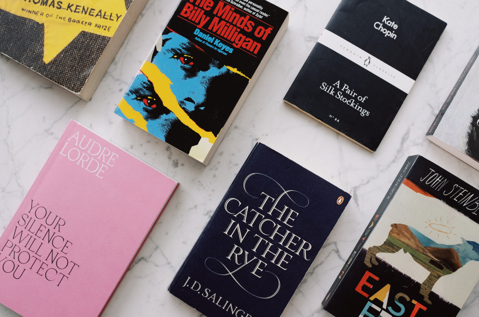
The first step in designing a great book cover is getting to know what your readers will be expecting. Your cover should have it’s own distinct look, but don’t be a rebel and put a cute kitten on a horror book (unless there’s blood splattered all around, of course). The cover should accurately represent the book’s content and genre to resonate with the intended audience. Pay attention to details and find elements that make clear what genre your book belong sin. 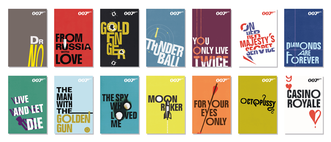
Think About the Future
If your book is the first in a series, design a cover that can be act as a template for future books. Use different colors or features that stay within the norms of the genre and connect all the books to one visual theme. The James Bond series is a great example of carrying the cover’s theme across several books. Several editions have been published, and each time the books carry a strong theme with little adjustments that hint at the plot of the book. Readers can easily see that each book belongs with the other, but they retain their individualism at the same time because the style retains a similar book.
Typography Matters
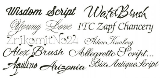
Typography can be a focal point that you can use to visually communicate emotion. Light, fluid script will be a clue for the reader that the plot will reflect the same tone. Heavy, bold script conveys a serious tone that is appropriate for stories with dangerous or important themes. And if your story takes place in a foreign land, there are several fonts that depict the writing associated with their culture. You can try using up to two different typefaces, such as a serif and sans-serif, to separate the title from the the other information on the book—the blurb, reviews, or the author name. More than that can look messy.

Avoid Clutter
Too many images, typefaces, and other information can make it difficult for the viewer to understand the cover’s core message. You want your design to immediately be understandable when someone sees the book. Clear images, readable text, and a strong layout will keep the look of your cover accessible for readers.
Use Contrast
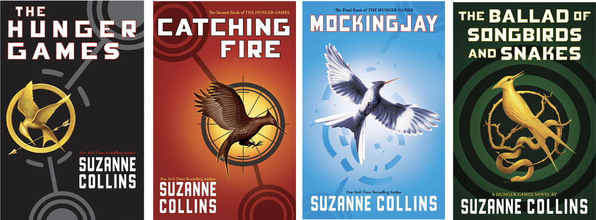
Style can profoundly affect the effectiveness of your book cover. Using contrasting colors between the background, the imagery, and the typography will catch the attention of people looking at a row of books more effectively than a flat look with monochromatic color combinations. In the case of The Hunger Games series, the mockingbird medallion is made a stronger element by using yellow-gold, either as a background color or as the color of the medallion itself, makes the key message of the cover stand out. Mockingjay’s cover shows how a strong contrast between light and shadow cast upon the bird in flight can carry that same theme using unexpected colors that suggests a different theme for this specific book, but using the same elements lets readers know it’s part of the series.
Consider the Size
Books come in all shapes and sizes, and size matters when it comes to cover design. Your book will probably need to look good as a full size cover, a digital thumbnail, and ideally as a square or banner. Whether your book will be sold in digital, print, or audiobook formats, consider how the cover will look in different sizes and whether it’ll stand out on the shelf next to similar books in your genre. The right size can help your book feel approachable and accessible to readers.

Capture readers with a cover that jumps out at them, intrigues them, and makes it impossible to pass by your book with these tips and you’ll find more readers pausing as they peruse the shelves. With an intriguing cover you have already gotten your foot in the door of your next committed reader!
Chanticleer Book Cover Design Awards celebrates the visual art of storytelling with
TWO NEW CIBA Award Divisions

Chanticleer is proud to announce two new CIBA Awards for Cover Design in the Fiction and Non-Fiction genres!
The first awards will be announced at the 2024 CIBA Ceremony and Banquet that will hosted on Saturday, April 5th, at the 2025 Chanticleer Authors Conference.
Click here for more information on the COVER DESIGN AWARDS for NON-FICTION works.
Click here for more information on the COVER DESIGN AWARDS for FICTION works.
Click here for more information about the Chanticleer International Book Awards program.
As always, please email info@ChantiReviews.com with any questions or suggestions!


